My Palette
One question I hear a lot of artists ask other artists is what kind of palette they use. This topic can be very interesting for some, and very, very boring for others. You've been warned.
Palette can mean the wooden doohicky you put the paint on, or it can mean the type of colors you prefer. Artist street lingo, I suppose. In a way it is kind of a "street" thing, in that artists sometimes look at other artists palettes like rival gang colors. You can't use this color, this brand, and it has to be laid out just so. I just use what I like in a way I prefer to use it. Some may judge me for it, some may gain ideas or tips from the way I do things. If it's the latter, I'll be flattered (hooray for rhymes!).
First off is a picture of the three palettes I use. I use several palettes because I want to keep my color schemes or mixtures separate. For example, if I have the perfect mix of color on one (or mostly warm colors), I'll go to a different palette that I can mix a different range of colors, such as cool colors. There's also times where I have to cover a large area with one range of color so I have to mix just a few paints but need a large area to mix it and get the tones I want.
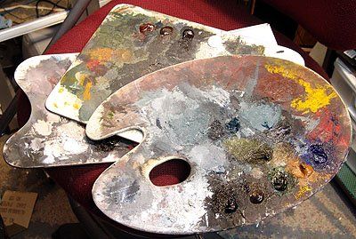
Right now, I'm using smaller palettes because it's easier to swap them around without knocking things over (I have a small studio space so this happens a lot). I also sit for the majority of my painting so they often sit on my lap, which makes the shape insignificant. Generally, I use the rounder palette more frequently and if I have to hold one if I'm standing, this one is more comfortable.
As far as laying my color on the palette... I tend to just put the colors I need at the time in places I find it most comfortable for me. No, I don't lay down every paint I have in a perfect color spectrum. It's organized from right to left in my head, so it's organized that way on my palette. The order I use most often is white, black, browns, blues, greens, reds, yellows. The green and red will change places sometimes, though.
Now to the colors. I have a lot of different hues, but I often use just a few. It's important to have anything you need at hand, so I do stock up on a variety of colors. This is what I use most, based on it's color range:
Blacks and Whites
Ivory Black
Titanium White
Browns
Raw Umber
Raw Sienna
Burnt Sienna (this will sometimes be my red, too)
Blues
French Ultramarine
Prussian Blue
Cerulean Blue
Reds
Cadmium Red Deep
Yellows
Yellow Ochre (used more then cad yellow)
Cadmium Yellow
Green
Sap Green
To me, that's a very expanded list. Most of the time my palette consists of mainly Raw Umber, Black, White and just minor additions of one of the primaries. It always seems to look like I use the primaries more, but I really don't.
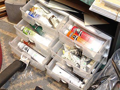
Oh yeah, and the plastic drawers are a life saver for organizing paint. It's much better then keeping them in a big heap and scrambling through it turning the labels toward you to find what you need. Just make sure you get strong drawers that can withstand some weight in them without coming off. The top drawer on the left is where my most used paint is, the one below it is for second most used paints. The rest of the drawers hold extras of my most used tubes or paint that I rarely use but keep around for when I need them.
Hope this helps answer some questions or even gives you some ideas that you can put toward your painting methods.
-Jeremiah White
posted by Jeremiah J White @ 2:02 AM
1 comments
![]()